Limited Spots This Month: Get a FREE CRO Video Audit + Action Plan. → Claim Now
Limited Spots This Month: Get a FREE CRO Video Audit + Action Plan. → Claim Now
Limited Spots This Month: Get a FREE CRO Video Audit + Action Plan. → Claim Now
Limited Spots This Month: Get a FREE CRO Video Audit + Action Plan. → Claim Now
Limited Spots This Month: Get a FREE CRO Video Audit + Action Plan. → Claim Now
 Book a Free Call
CRO and landing pages for Shopify
Revenue per visitor from a bundle block on the product page.
Artem Straps+17.9%Revenue per visitor from one honest stock check at checkout.
Artem Straps+14.6%Revenue per visitor from a new advertorial headline.
BSQBlog
Your Add to Cart Should Be Above the Fold
A product page teardown of the EVANNEX RennStand. What the first screen shows today, what we would change, and the A/B test data behind each fix.
October 05, 2026
The first screen decides the sale
Open almost any product page on your phone and count what you can see before you scroll. On a lot of Shopify stores the answer is a large photo, a breadcrumb, maybe a cookie bar, and nothing that tells you what the product is, what it costs, or why you should trust it. The buy button sits two or three thumb swipes down the page.
That matters because most of your traffic is on mobile, and most mobile visitors decide in the first few seconds whether to keep going. If the first screen does not answer three questions, many of them never reach the part of the page that does.
- What is this?
- Why is it worth it?
- How much is it, and how do I buy it?
We used the EVANNEX RennStand as our example, a jack and lift pad stand for Tesla owners. It is a good product with a clear use case, which makes it a useful example. The problems on the page are not about the product. They are about the order things appear in.
What the current page shows
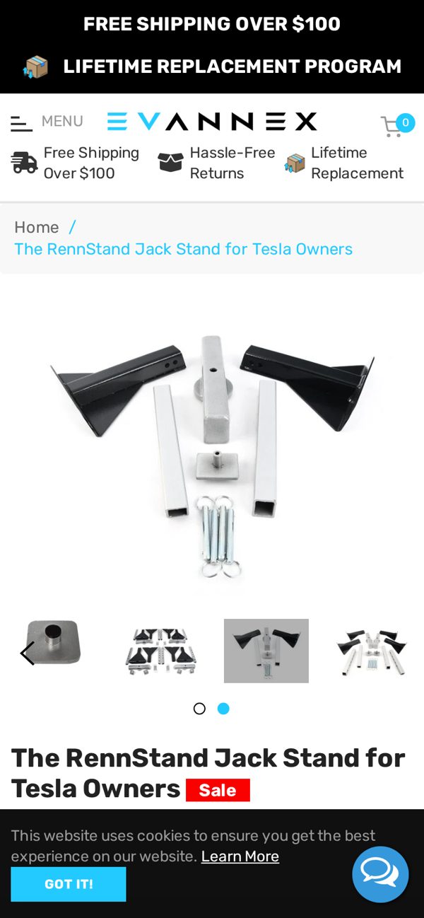
Here is what a mobile visitor sees on the live product page today, before scrolling:
- A photo of the parts laid out in a pile, not the stand in use under a car.
- No price anywhere on the first screen.
- A cookie banner sitting over the area where the buy section should start.
- No star rating, no review count, and no fitment information for which Tesla models it works with.
None of these are unusual. We see some version of this on most stores we audit. But together they mean the visitor has to work to understand the offer, and every bit of work you ask for costs you buyers.
What we changed in the concept
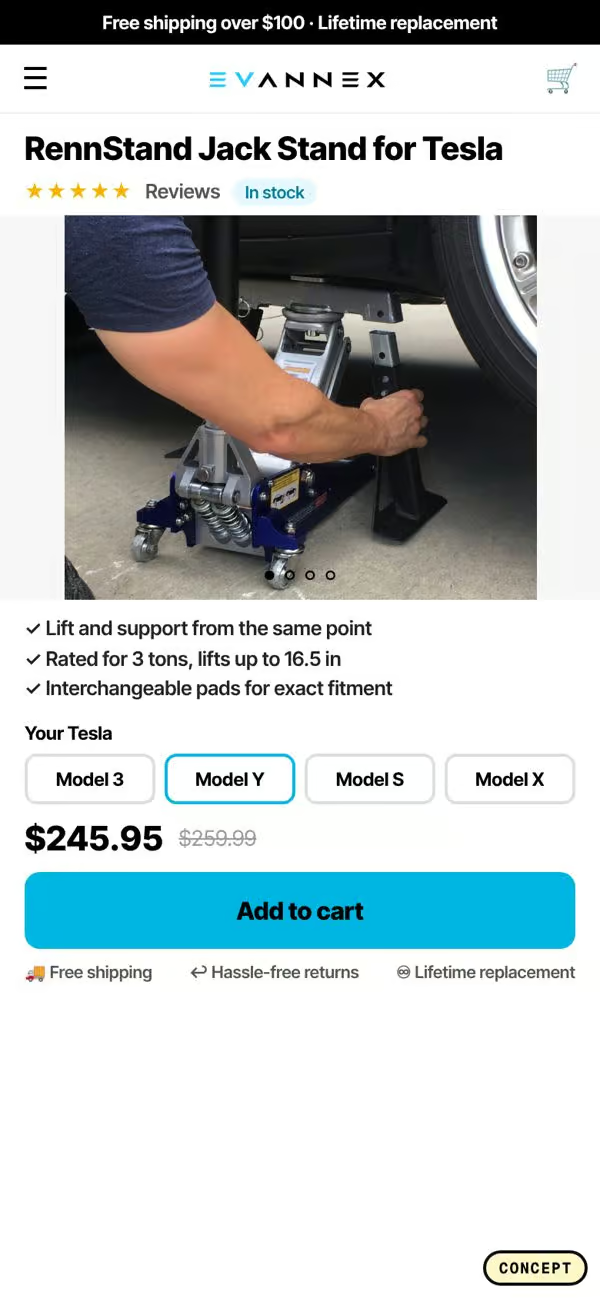
Our redesign concept keeps the brand, the product, and the photography style. It only changes the order and the framing.
- Title and stars first. The product name and the review rating sit at the very top, so the visitor knows what it is and that other people bought it.
- An in-use photo as the hero. The first image shows the stand doing its job under a Tesla, not a box of parts. The picture is the pitch.
- Benefit bullets next to the button. Three short lines that explain why it is worth buying, placed right beside Add to Cart instead of buried in the description.
- A Tesla fitment picker. Owners pick Model 3, Model Y, Model S or Model X, so the biggest objection, will this fit my car, is answered before they ask it.
- Price and Add to Cart visible on the first screen, with the cookie notice moved to a small bar that does not cover the buy area.
The test data behind each change
We do not redesign on taste. Every change in this concept maps to an A/B test pattern that has already won on other ecommerce stores. These are the results we used, as lift ranges reported from past tests:
- Unique selling points above the fold: +23.1%.
- Price anchoring, showing the compare price or the value next to the real price: +14.2% to +18.2%.
- A delivery tracker or delivery estimate near the button: +13.7% to +19.4%.
- An upsell placed above Add to Cart: +5.2% to +18.1%.
- An us vs them comparison block: +10.5%.
- A sticky Add to Cart bar on mobile: +8.0%.
These numbers are not a promise for any single store. They are a reason to test. A pattern that has won across many stores is a much better starting bet than a hunch from a design meeting.
Why above the fold matters more on mobile
On desktop a visitor can see the photo, the title, the price, and the button side by side. On a phone everything is stacked. If the photo takes the whole screen, the title, price, and button are pushed below it.
That is why we treat the first mobile screen as a mini sales page. It should hold:
- The product name in plain words.
- Proof, usually a star rating and a review count.
- The price, and a reason the price is fair.
- The primary button, or at least the start of it.
When a visitor scrolls, the sticky Add to Cart bar keeps the button in reach, so they never have to scroll back up to buy.
Fitment is a conversion problem, not a content problem
For any product that has to fit something, a car, a phone, a size, a machine, the question will it work for me is the biggest blocker on the page. Most stores answer it in a long table near the bottom, or in the FAQ, or not at all.
A simple picker at the top of the page turns that question into a click. It also gives the visitor a small commitment before they hit Add to Cart, which makes the next step feel easier. In the RennStand concept the picker sits directly above the button, so the flow reads: pick your model, see it fits, add to cart.
How to apply this to your own product page
You do not need a full redesign to get most of the value. Start with a screenshot of your product page on a phone and run through this checklist:
- Can someone tell what the product is without scrolling?
- Is the price visible on the first screen?
- Is there a star rating or review count near the title?
- Is the first photo the product in use, or a plain packshot?
- Is anything covering the buy area, like a cookie bar, chat bubble, or popup?
- Is there a sticky Add to Cart on mobile?
- If the product has to fit something, can a visitor check fit in one tap?
Every no on that list is a test you can run. Start with the one that affects the most traffic, usually the first screen, and work down.
The short version
Your Add to Cart should be above the fold, and so should everything a visitor needs to press it with confidence: what it is, why it is worth it, what it costs, and proof that other people bought it. Move those to the top, keep the button in reach, and answer the biggest objection before the visitor has to ask.
If you want to see how 28 of the best DTC brands handle this, we put their product pages side by side in a free breakdown. It shows the same eight patterns over and over, from Gymshark to Allbirds to Graza.
Concept only, not affiliated with EVANNEX. Screenshots are of the public product page and our own redesign concept.