Limited Spots This Month: Get a FREE CRO Video Audit + Action Plan. → Claim Now
Limited Spots This Month: Get a FREE CRO Video Audit + Action Plan. → Claim Now
Limited Spots This Month: Get a FREE CRO Video Audit + Action Plan. → Claim Now
Limited Spots This Month: Get a FREE CRO Video Audit + Action Plan. → Claim Now
Limited Spots This Month: Get a FREE CRO Video Audit + Action Plan. → Claim Now
 Book a Free Call
CRO and landing pages for Shopify
Revenue per visitor from a bundle block on the product page.
Artem Straps+17.9%Revenue per visitor from one honest stock check at checkout.
Artem Straps+14.6%Revenue per visitor from a new advertorial headline.
BSQBlog
Same Hero, One Clear Next Step: An Arccos Homepage Teardown
We kept the look of the Arccos homepage and changed what the hero says and asks for. Here is the concept and the homepage test data behind it.
October 08, 2026
A good-looking hero can still lose the click
Arccos makes golf shot tracking sensors and an app that tells golfers how far they really hit each club. The brand looks premium. The photography is strong. The homepage hero is the kind of section most design teams would be happy to ship.
It still has a conversion problem, and it is a common one. The hero looks good but does not tell a new visitor clearly what they get, and it gives them more than one direction to go. When a homepage asks a visitor to choose, many of them choose to leave.
This teardown keeps the look and changes the job of the hero. Same brand, same colors, same imagery style. One clear message and one clear next step.
What the current hero does
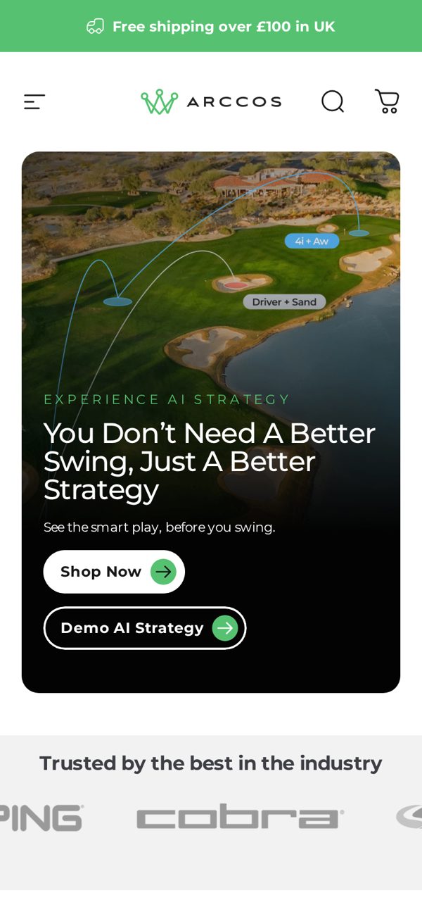
On mobile, the first screen of the live homepage shows a lifestyle image and a short brand line. A visitor who does not already know Arccos has to guess:
- What the product actually is, a sensor, an app, or both.
- What result it gives them on the course.
- Whether other golfers trust it.
- Which button they should press first.
None of those are hard to fix. They just need to be on the first screen instead of further down the page.
What we changed in the concept
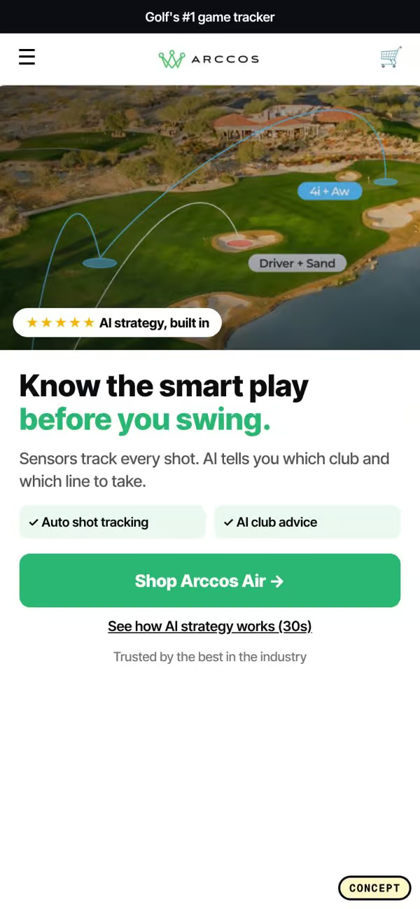
- A benefit headline. Instead of a brand statement, the headline says what the golfer gets, in plain words. Think lower scores and knowing your real club distances, not a slogan.
- One primary call to action. One loud button that goes to the product, with any secondary link made visually quiet.
- A rating badge on the hero. A star rating and review count sit right under the headline, so proof appears before the visitor scrolls.
- Feature chips. Small labels under the button that list the key features at a glance, like automatic tracking and club distances, so the visitor understands the product in two seconds.
The homepage test data behind it
Every change maps to a pattern with past test results behind it. These are the homepage patterns we used for this concept, with the lift reported in previous A/B tests:
- An optimized header and hero: +28.1% revenue per visitor.
- A 2x2 product grid on mobile: +10.4% to +26.6%.
- Add to Cart buttons on product cards: +24.4%.
- Full product titles on cards instead of cut off names: +15.5%.
- Search above the fold: +11.3%.
- Circle category navigation near the top: +10.1%.
The hero changes come first because they touch every single homepage visitor. The grid, card, and navigation changes come next because they help visitors who scroll and browse.
Why one primary button beats two
It feels safe to give visitors options: Shop Now and Learn More, or Shop Sensors and Shop Bundles. In practice, two equal buttons split attention. The visitor has to stop and decide, and every decision is a chance to leave.
One primary button removes the decision. If you need a second path, make it a text link or a quiet outline button so the main action is obvious. On the Arccos concept the hero has a single button that takes golfers straight to the product, and everything else waits below.
Proof belongs in the hero
A new visitor is asking one silent question on your homepage: is this legit? A star rating and a review count answer it faster than any paragraph. When that proof sits under the headline, the visitor gets the claim and the evidence in the same glance.
This is one of the simplest changes on this list, and one of the most often missed. Many stores have hundreds or thousands of reviews and only show them on the product page.
Feature chips do the explaining
Long feature paragraphs on a homepage rarely get read on mobile. Chips, small rounded labels with two or three words each, give a visitor the gist in a second. They also make the hero feel more concrete. A golfer who sees automatic shot tracking and real club distances right away understands the product without reading a word of body copy.
How to audit your own homepage hero
Take a screenshot of your homepage on a phone and answer these questions honestly:
- Does the headline say what the customer gets, or what the brand is?
- Is there exactly one primary button?
- Is there proof, a rating or a number of customers, on the first screen?
- Can someone understand what you sell in under five seconds?
- If you sell several products, is there a quick way to browse, like category circles or search?
If the answer to any of these is no, that is your first test. Change the headline and button first, measure revenue per visitor, then move to proof and navigation.
The short version
You do not need a new brand or a new design system to improve a homepage. Keep the look. Change the message to a benefit, cut the buttons to one, put proof in the hero, and explain the product with short chips. Then test the browsing patterns that help visitors who scroll.
If you want us to look at your homepage and tell you which of these tests to run first, book a free CRO audit.
Concept only, not affiliated with Arccos. Screenshots are of the public homepage and our own redesign concept.