Limited Spots This Month: Get a FREE CRO Video Audit + Action Plan. → Claim Now
Limited Spots This Month: Get a FREE CRO Video Audit + Action Plan. → Claim Now
Limited Spots This Month: Get a FREE CRO Video Audit + Action Plan. → Claim Now
Limited Spots This Month: Get a FREE CRO Video Audit + Action Plan. → Claim Now
Limited Spots This Month: Get a FREE CRO Video Audit + Action Plan. → Claim Now
 Book a Free Call
CRO and landing pages for Shopify
Revenue per visitor from a bundle block on the product page.
Artem Straps+17.9%Revenue per visitor from one honest stock check at checkout.
Artem Straps+14.6%Revenue per visitor from a new advertorial headline.
BSQBlog
Your Mobile Menu Should Start With Shopping
A mobile menu teardown of Mainstream. Why shop categories, image tiles, and search should come before About Us and Contact.
October 19, 2026
The menu is a shopping tool
On a phone, the menu is one of the most used parts of the site. Visitors tap it when they know what they want, when they are lost, and when they want to browse. Yet on many stores the mobile menu reads like a site map. About, Our Story, Contact, FAQ, and somewhere in the middle, the products.
Mainstream is a good example of a menu that can do more. The fix is not a new design. It is a new order.
What the current menu shows
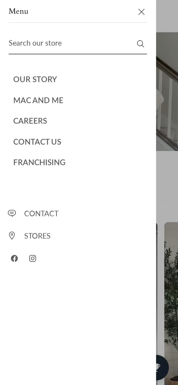
When a visitor opens the live mobile menu they see:
- A plain text list, with company pages mixed in with shop links.
- No images, so every category looks the same.
- No search at the top, so a visitor who knows what they want has to hunt for it.
- No offer or reason to keep browsing.
What we changed in the concept
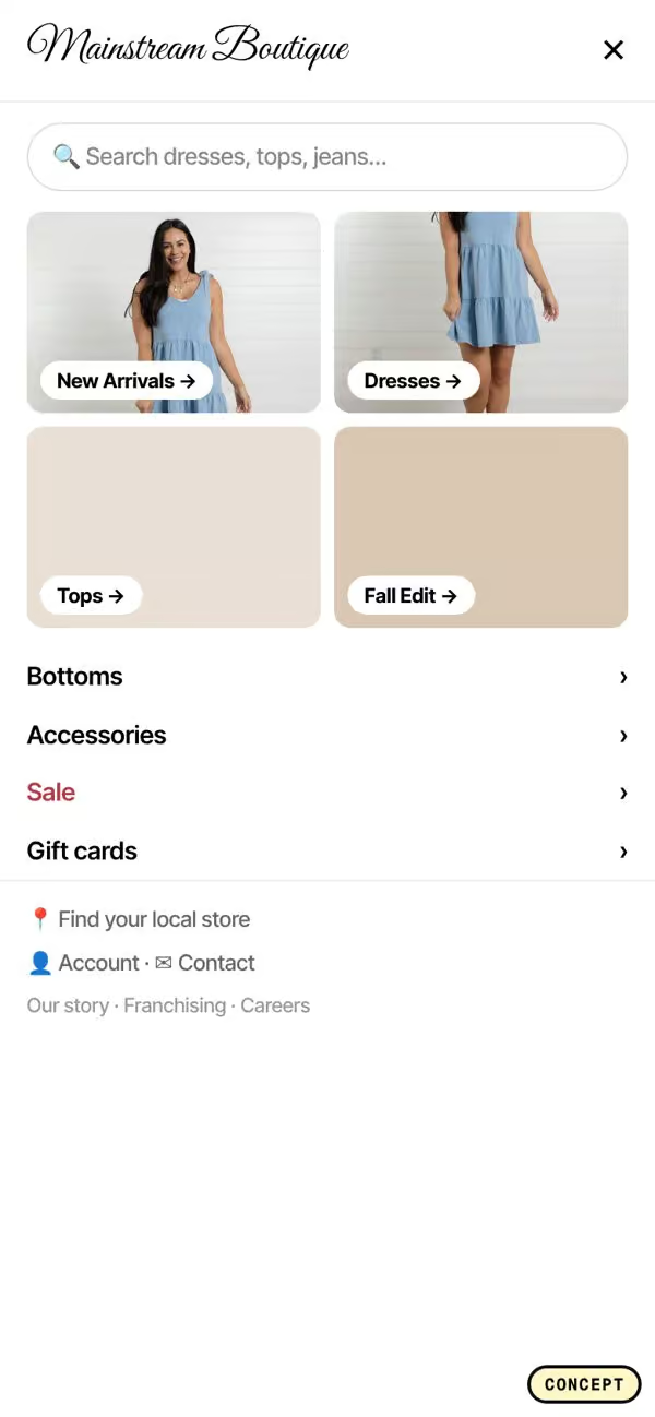
- Shop categories first. The first items in the menu are what you sell, in the order people buy them.
- Image tiles. Each main category gets a small photo, so the visitor can recognize what they want at a glance.
- Search on top. A search bar is the first thing in the menu, so people who know what they want can type it.
- Company links last. About, Contact, and FAQ move to the bottom, in a smaller style.
The test data behind it
These are the menu patterns we used, with the lift reported in past A/B tests:
- A product slider inside the menu: +11.3%.
- Trending searches shown in the search area: +10.4%.
- An offer banner in the menu: +6.5%.
- Brand link optimization, moving company links down: +1.0%.
The product slider and trending searches are the biggest wins because they help visitors who opened the menu without a clear plan. Instead of an empty list, they see products and popular searches.
Why images beat text in a mobile menu
Text links all look the same. A visitor has to read each one and imagine what is inside. Image tiles do that work for them. A photo of a jacket or a bag makes the category obvious in a split second, and it makes the menu feel like part of the store instead of a list of links.
Keep the tiles small and the labels short. Two columns usually work best on a phone.
Put search where people look first
Visitors who use search usually know what they want, and they tend to convert well. If search is hidden behind an icon in the header, some of them never find it. Placing a search bar at the top of the open menu, with a few trending searches under it, catches those visitors and gives everyone else ideas.
Company pages still matter, just later
About and Contact pages build trust, and some visitors will want them. They just should not come before the products. Move them to the bottom of the menu in a smaller font. People who want them will still find them, and everyone else gets to shopping faster.
Add one offer, not five
An offer banner inside the menu, like free shipping over a set amount or a current promotion, reminds visitors why to buy now. One short line is enough. A menu full of banners becomes noise.
How to audit your own mobile menu
Open your site on a phone, tap the menu, and look at it like a new visitor:
- What is the first thing you see, products or company pages?
- Is there a search bar inside the menu?
- Do categories have images, or just text?
- Is there anything to help someone who is just browsing, like best sellers or trending searches?
- Is there a reason to buy today, like an offer line?
Start by moving shop categories to the top and company links to the bottom. That change takes minutes. Then test images, search, and a product slider.
Test one change at a time
It is tempting to ship all of these together. If you can, test them in steps instead. Start with the order of the links, then add search, then images, then the slider. That way you know which change moved revenue, and you can keep the winners when you redesign later. Track revenue per visitor from mobile sessions that opened the menu, not just clicks on menu items.
The short version
Your mobile menu should start with shopping. Put products and search first, use images so categories are easy to spot, help browsers with a slider or trending searches, and move company links to the bottom.
If you want us to look at your menu, homepage, and product pages together, book a free CRO audit.
Concept only, not affiliated with Mainstream. Screenshots are of the public site and our own redesign concept.